

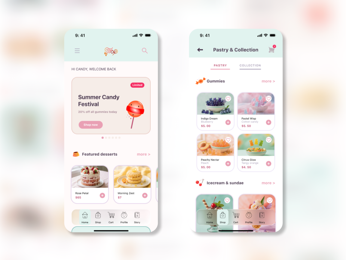
01 / CONTEXT
A boutique brand needed one store for two shopping mindsets.
CLIENT
Dessert-and-collectibles boutique
Handcrafted treats, collectible products, limited drops, and playful gifting.
AGNECY
NEXUS Creative
Marketing agency responsible for brand, campaign, and digital experience development.
MY ROLE
UX research · UX/UI design
Design system · Prototyping
Working responsive web prototype.
02 / BRIEF
The app had to make discovery feel playful without making shopping confusing.
THE CHALLENGE
Sweetrap’s social and physical retail presence created desire, but customers needed a clearer mobile path to browse, collect, gift, and buy.
INITIATIVE
How might we bring two different shopping mindsets — appetite and collecting — into one coherent mobile experience?
03 / RESEARCH
Four insights shaped the product direction.
Browse before buy
01
Discovery is part of the product experience.
→ Editorial home with seasonal storytelling.
Scarcity, honestly
02
Limited products need clear status and timing.
→ Limited labels and availability messaging.
Two minds, one store
03
Desserts and collectibles need equal visibility.
→ Peer-level navigation and collections.
Gifting is a mode
04
Recipient and buyer information are different.
→ Gift options introduced in Cart.
Evidence: 10 interviews · 30 survey responses · competitor review analysis04 / AUDIENCE
The primary user is motivated by discovery, collecting, and gifting.
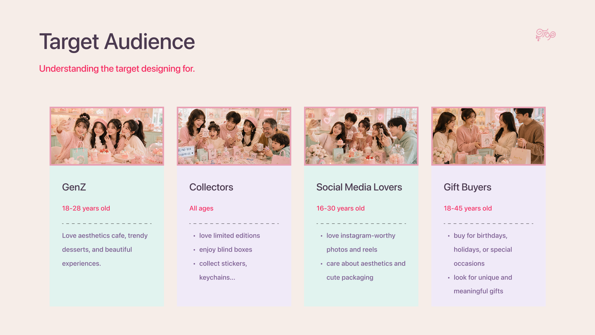
PRIMARY AUDIENCE
Collectors and brand fans
→ Limited labels and availability messaging.
SECONDARY
Dessert explorers · Gift buyers · Social discovery shoppers
Composite persona based on 10 interviews and 30 survey responses.05 / STRATEGY
The design principles turned research into product decisions.
Browse before buy
01
Home earns attention before it asks for a purchase.
02
Gifting is a mode
Recipient, wrap, and message belong in the core flow.
03
Scarcity, honestly
Show what is limited, available, and worth anticipating.
04
Two minds, one store
Desserts and collectibles are equal categories.
06 / STRUCTURE
A dual-category architecture keeps browsing simple.
HOME
Desserts · Collectibles · Collections · Membership · Story · Profile
CORE FLOW
Discover → Explore → Product Detail → Cart → Checkout → Confirmation
Design decision: Desserts and Collectibles are peer categories.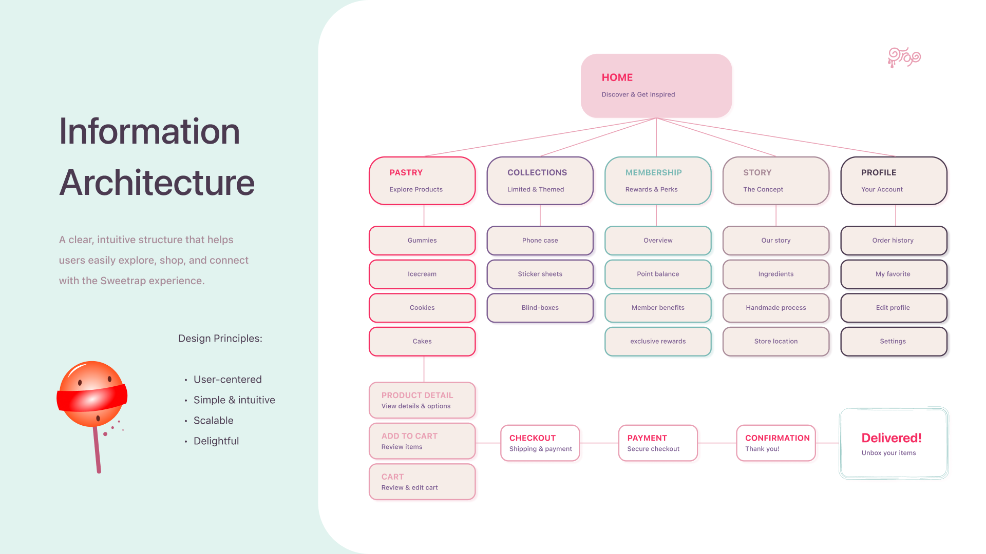
07 / UX EXPLORATION
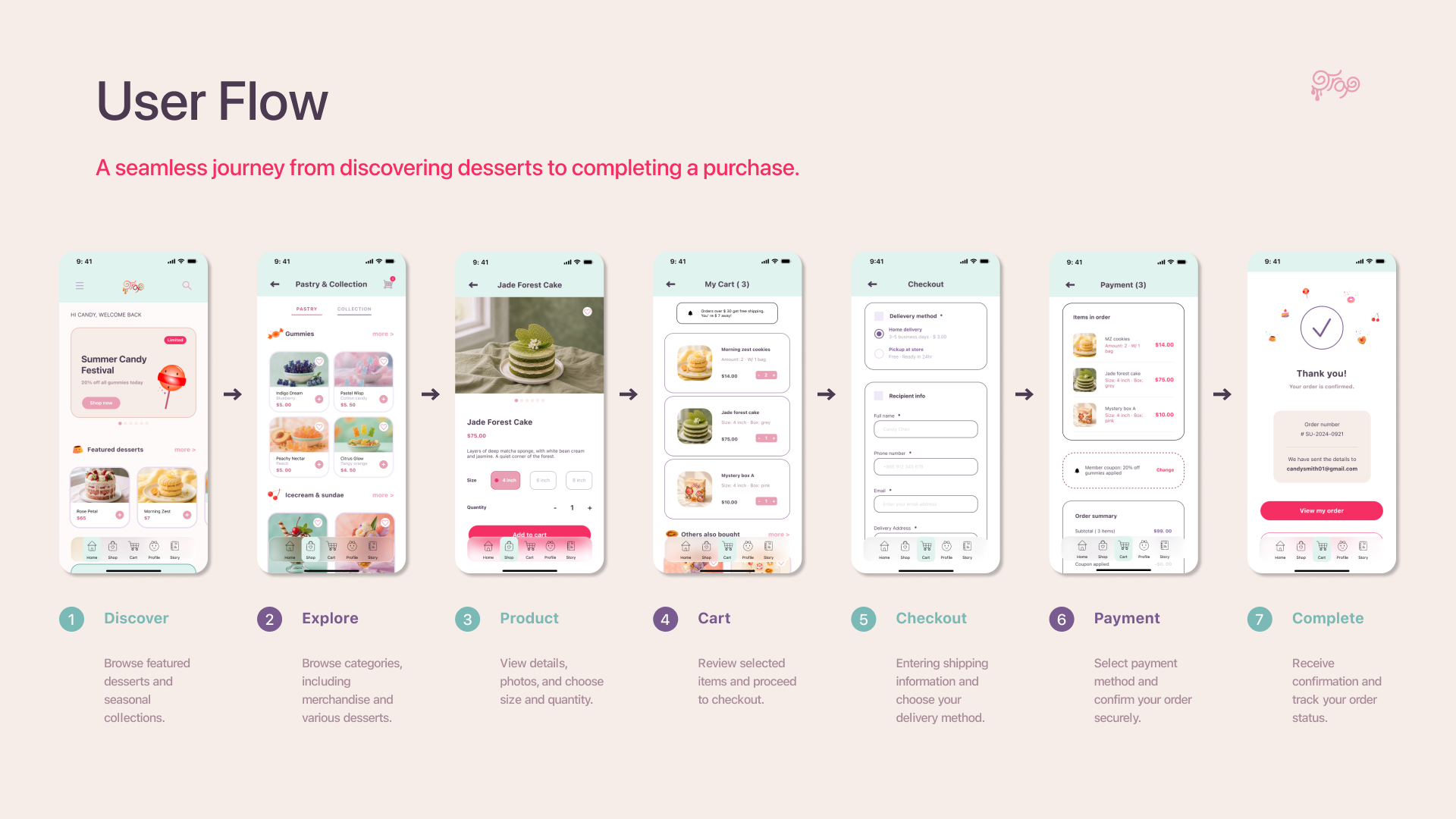
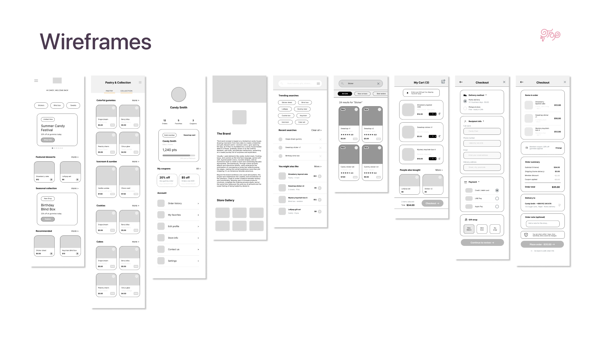
Wireframes focused the experience around discovery and purchase confidence.
KEY DECISIONS
01 Category tabs separate desserts and collectibles.
02 Product details clarify options before purchase.
03 Gift options are introduced in Cart.
04 Delivery and pickup appear before payment.
08 / DESIGN SYSTEM
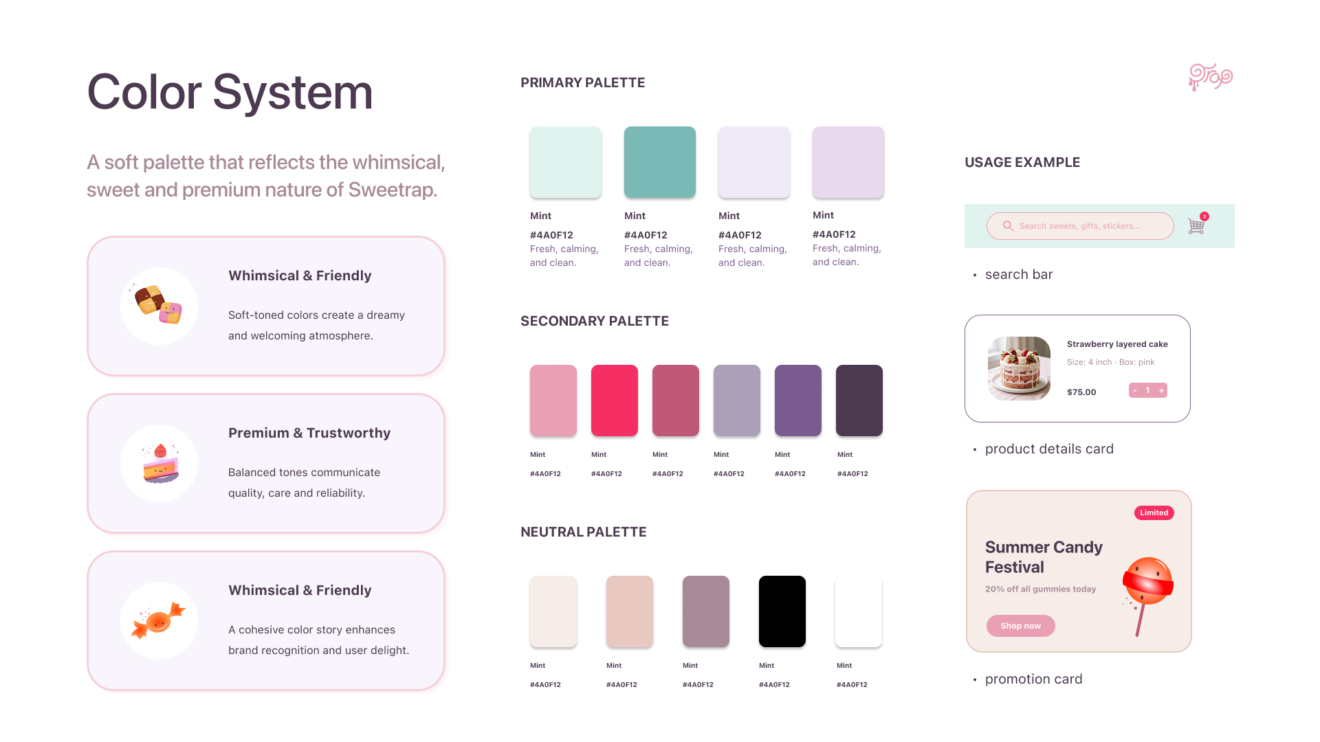
A soft, playful visual system supports a clear commerce experience.
COLOR ROLES
Mint / App surfaces
Jade / Active states
Lilac / Collections
Raspberry / CTA + limited status
Aubergine / Body text
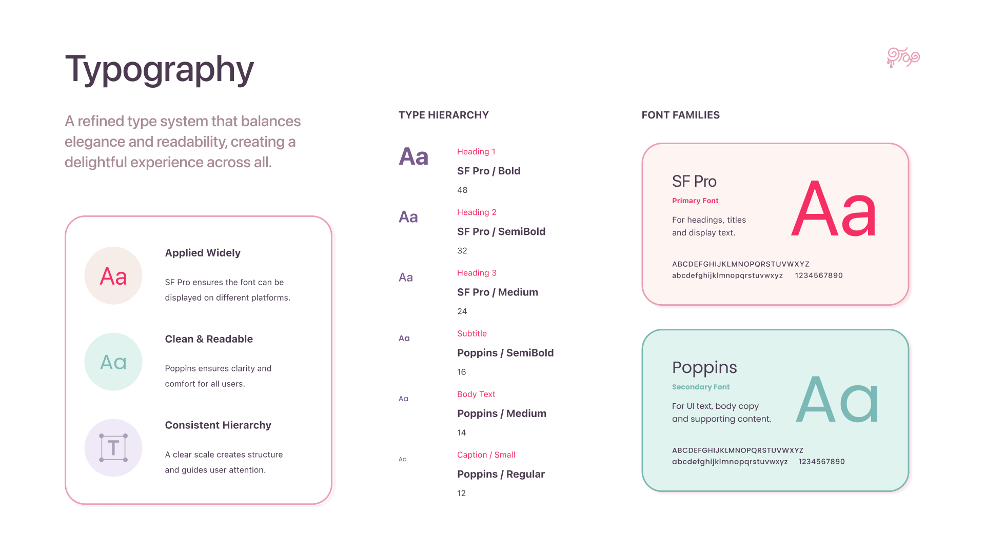
TYPE
Poppins
UI and body typography
Slackside One
Decorative brand accents only
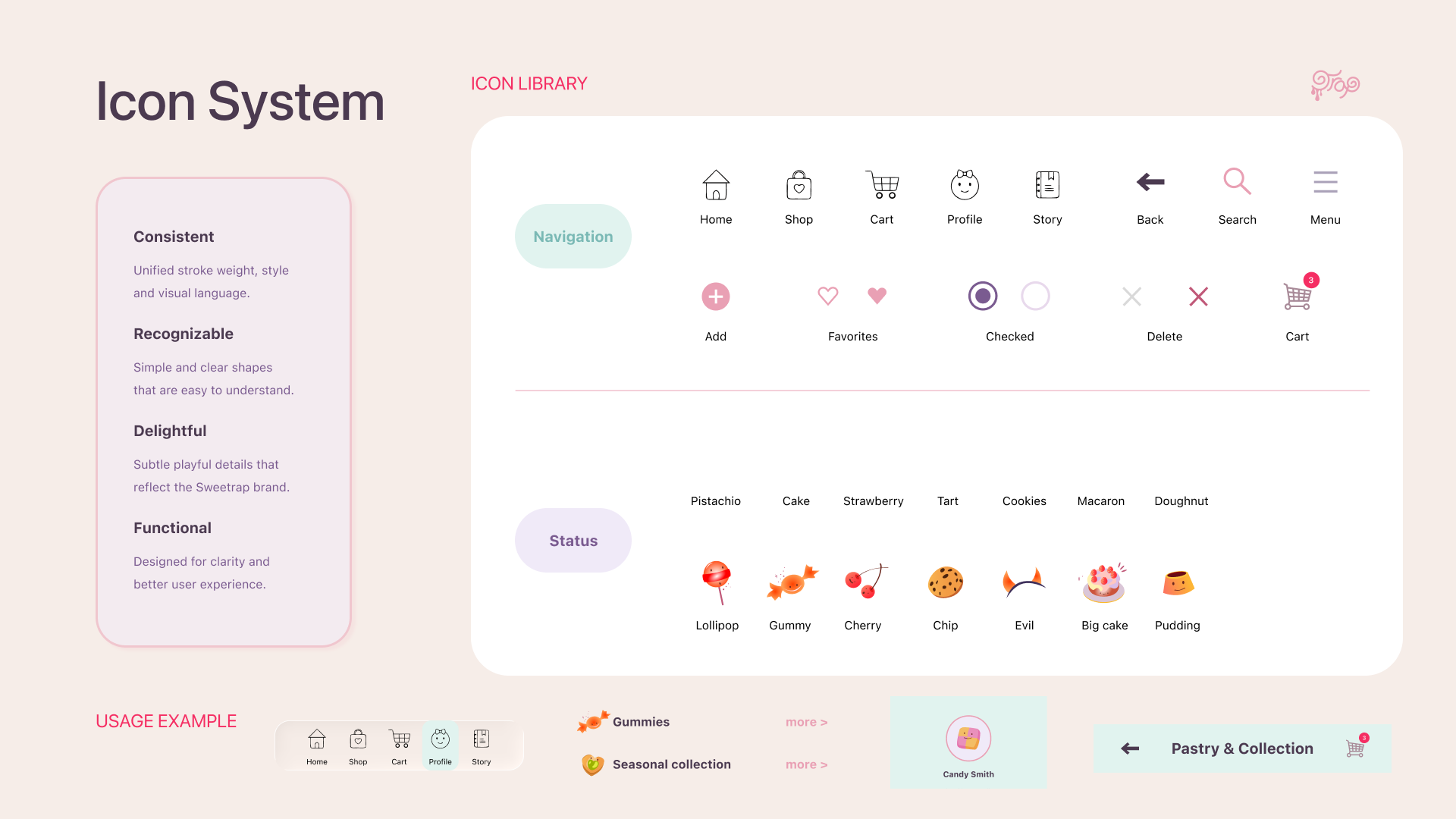
ICON RULES
24 × 24 px grid
1.5 px stroke
44 × 44 px touch target
Text or accessibility label for icon-only controls
09 / FINAL UI
The final screens turn the strategy into a browsable, collectible store.
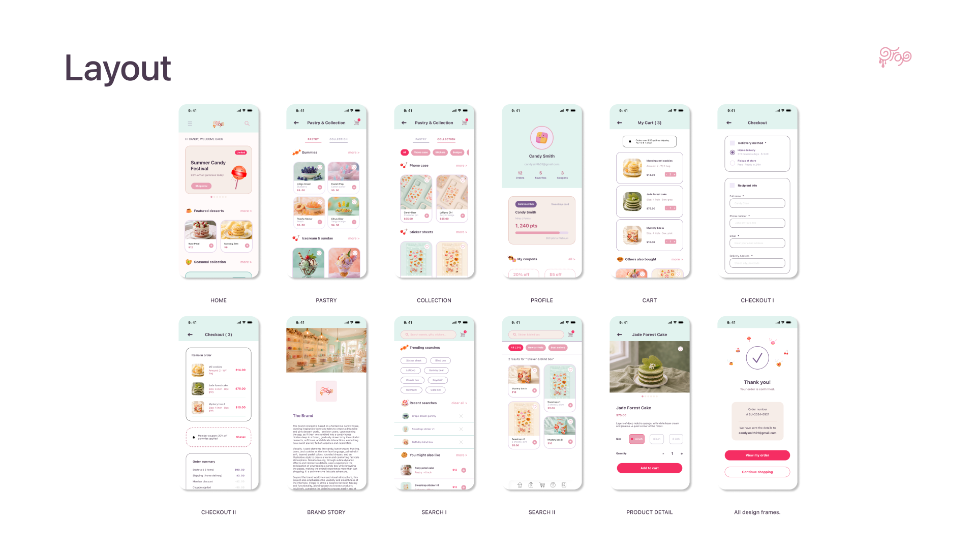
EDITORIAL HOME
Discovery comes before checkout.
PEER CATEGORIES
Desserts and collectibles share equal navigation weight.
GIFTING IN CART
Recipient details appear before payment.
10 / BUILD
The visual direction became a working responsive web prototype.
The product was implemented as an interactive web experience so the complete browse-to-checkout journey could be evaluated beyond static screens.
DESIGN → BUILD → TEST
Live prototype: sweetrap.vercel.app
IMPLEMENTED EXPERIENCES
Home and category browsing
Search and recent searches
Product detail and options
Add to cart and quantity updates
Checkout states
Order confirmation
11 / PRODUCT PROOF
A live prototype made interaction quality visible.
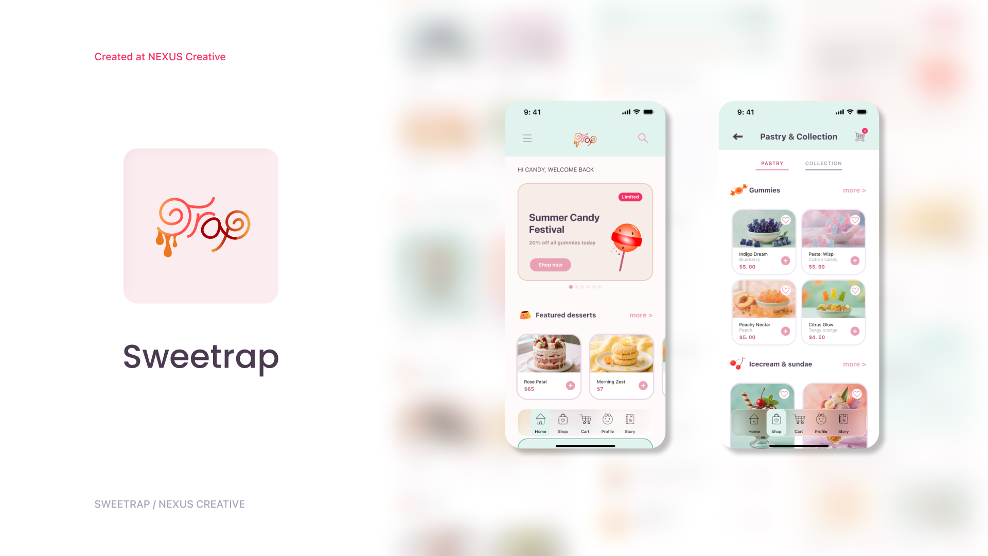
WORKING PRODUCT
Open the live prototype to explore:
Status: working responsive web prototype
Payment, inventory, and fulfillment are simulated.
12 / VALIDATION
Testing the working flow revealed where the experience still needed clarity.
10 participants · 5 tasks
Live web prototype · Think-aloud sessions
TEST METHOD
Gift options were easy to miss.
Product options looked like filters.
Limited status needed stronger emphasis.
Quantity controls needed larger targets.
KEY ISSUES
ITERATION 1
Move gift wrap and recipient information into a dedicated Cart section.
ITERATION 2
Add CLEAR button on the Filter bar to reduce user’s unnecessary steps.
ITERATION 3
Move all store information to the top in Home, followed by the products.
13 / DELIVERY
The project connects brand, UX, UI, and a working product prototype.
· Unified desserts and collectibles in one clear mobile structure
· Created a working browse-to-checkout experience
· Built a reusable visual and interaction system
· Identified improvements through prototype testing
OUTCOME
· Connect inventory and payment systems
· Validate with a larger audience
· Test limited-drop notifications
· Extend the system to tablet and kiosk
NEXT STEPS
Sweetrap turns browsing, collecting, and gifting into one connected experience.